
Rethinking a job candidate's digital experience
Conducting research and presenting strategies to improve Principal’s candidate experience from application to first 90 days on the job.
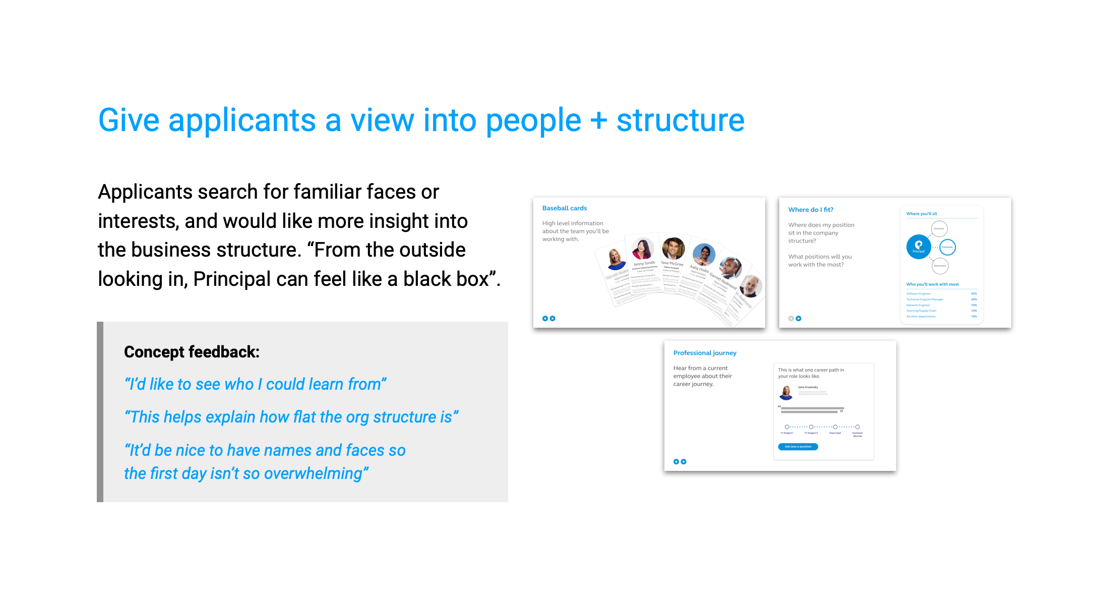
The project ask
The Principal Talent Acquisition team asked us to look at their candidate experience, focusing on digital touchpoints, but not limited to them.
We took a deep dive into real job candidate’s thoughts and behaviors to identify our areas for improvement — opportunities where digital strategy can help drive the most impact toward attracting candidates, specifically in digital experience, marketing, and IT positions.
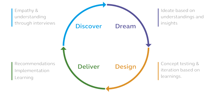
We applied a fairly straightforward human centered design framework to the applicant experience. We started by doing our best to understand the problem, went broad thinking of ideas, narrowed our focus through testing, then delivered a set of recommendations which we helped implement.
My role in the project
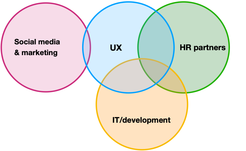
I led this project and served as the sole design resource for most of the work, but worked closely with members of our HR department, marketing strategists, and hiring managers.
That meant keeping things on track & pushing when they were stagnant, conducting low budget (but effective) user research, presenting what we found to senior executives, and delivering prototypes to front end developers – then working with them on implementation. It was a huge growth opportunity.
Timeline
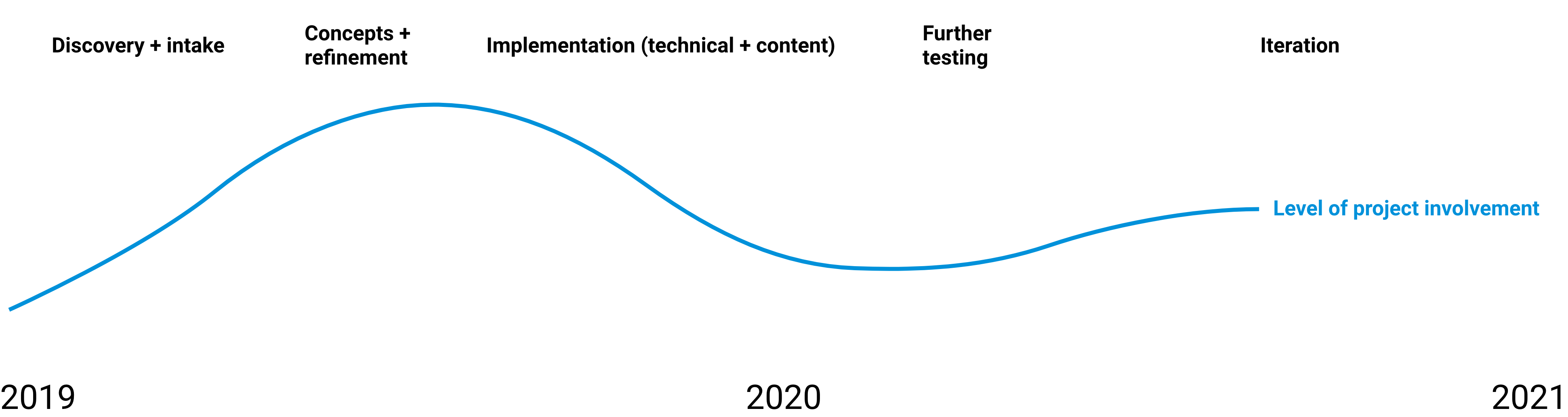
The bulk of the project work (including minimum viable changes) took place during 3-4 months throughout late 2019. Followup and iteration on those changes started in late 2020.
Project outputs
Early research: Finding pain points
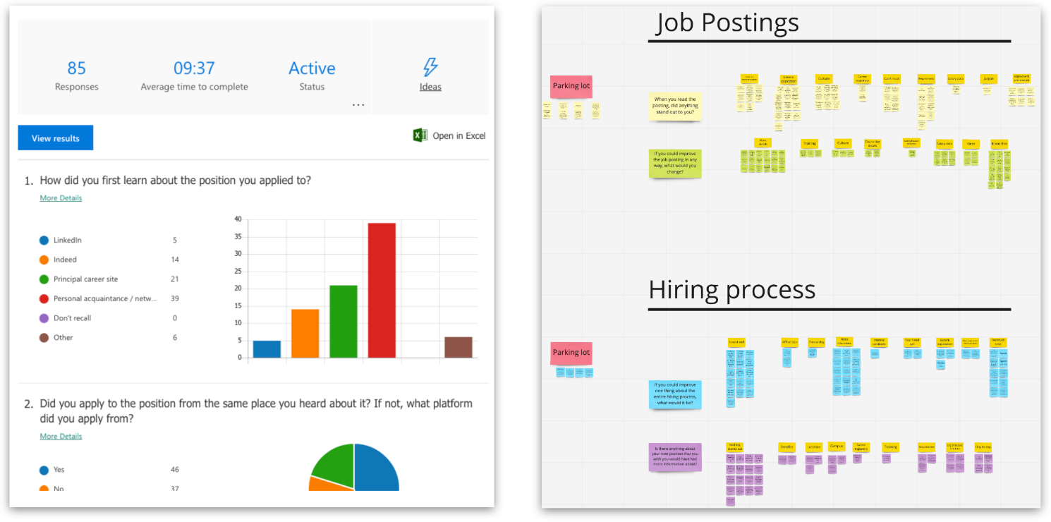
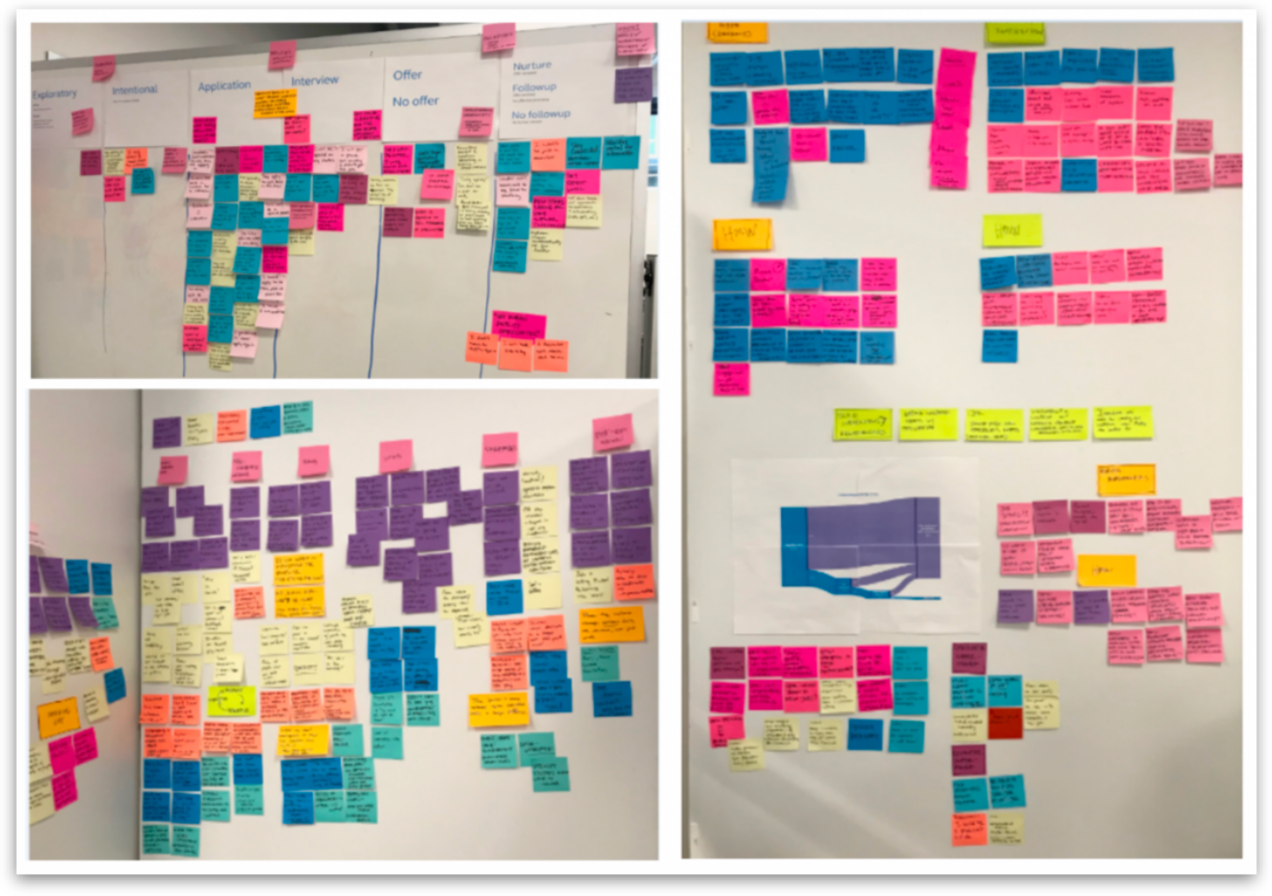
Early on, we conducted 1:1 interviews with recent hires and facilitated group sticky/whiteboarding sessions with first-year employees. We asked about experiences with the hiring process, how they heard about positions, job postings, and general perceptions before starting at Principal. We conducted affinity mapping exercises with the results using Miro (automatically importing cells of feedback as sticky notes is practically magic) and built concepts using what we heard.
Early research themes
New hires want to showcase their value from the first day.
“You hired me for a reason, I have a specific skill set – I’m ready to work”
Emotion: Provide confidence and connectedness early on.
Need: Remove the feeling they are burdening their team or manager with too many requests.
Expectation: Manager will assign real tasks or projects on day one.
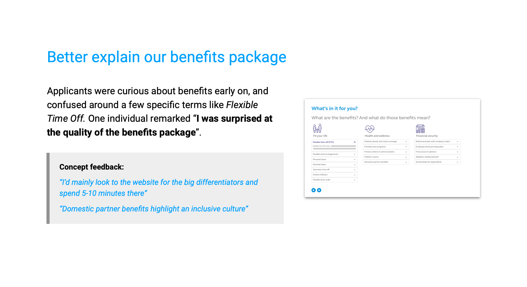
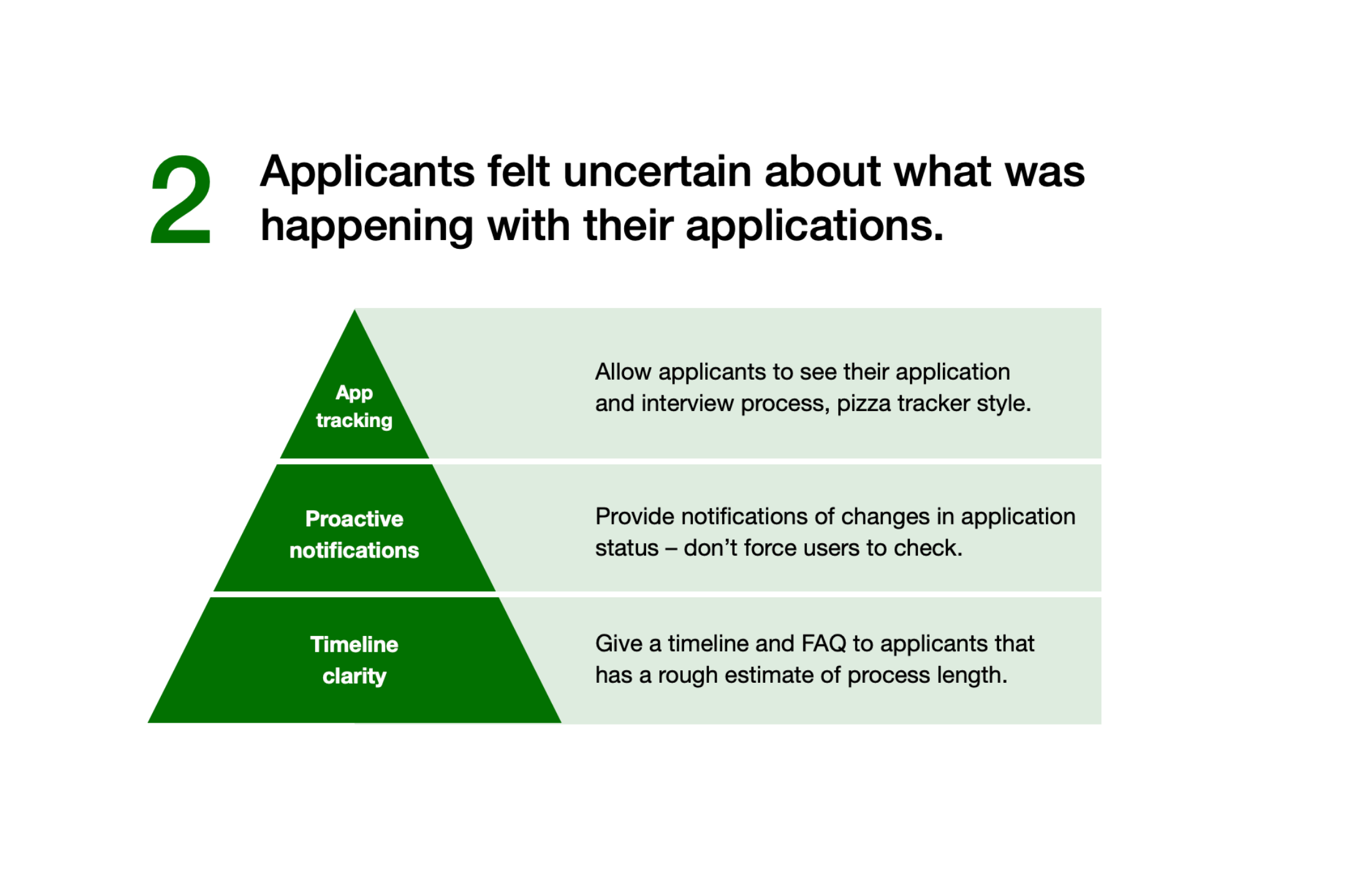
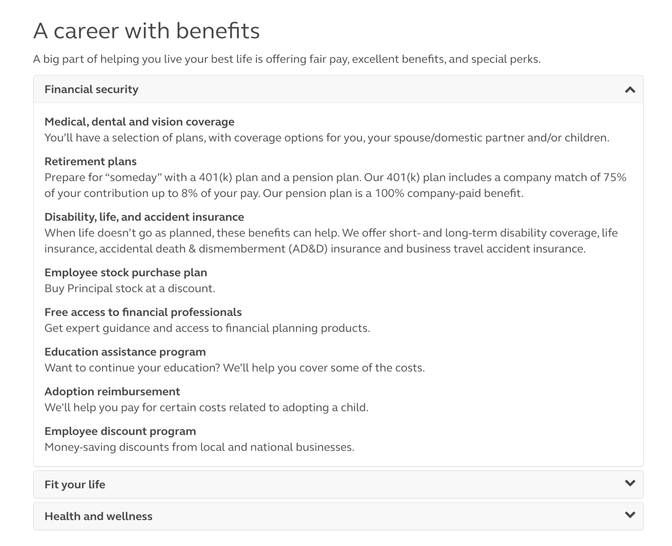
New hires need better clarity around benefits.
“Tangibly bring the benefits to life for me, from day one”
Emotion: Give them some validation that they made the right choice.
Need: “Instant gratification” from new job (versus forcing them to wait for info & trust that the benefits exist.
Expectation: Benefits can be clearly summarized and described.
Reduce the mental load of new hires.
“Why are you giving me a start date if I won’t have an email address?”
“It’s overwhelming to walk onto this campus, starting with the parking garages.”
Emotion: Starting a new job is incredibly overwhelming.
Need: Give a warm welcome by minimizing the logistical hassles.
Expectation: Principal is ready for me to start, and working to make me successful.
Later research: Testing concepts
Later, we focused on testing concepts and finding pain points. We talked to recently hired internal employees, early career financial advisors, and target personas in marketing, experience design, IT, and business analyst positions. Interviews were split between in-person and virtual.
For interviews with non-internal employees outside the Midwest, we recruited using unsponsored posts on our own LinkedIn profiles, shared by internal talent scouts. This proved to be low cost (just a stipend and our time) and effective at locating current job seekers.
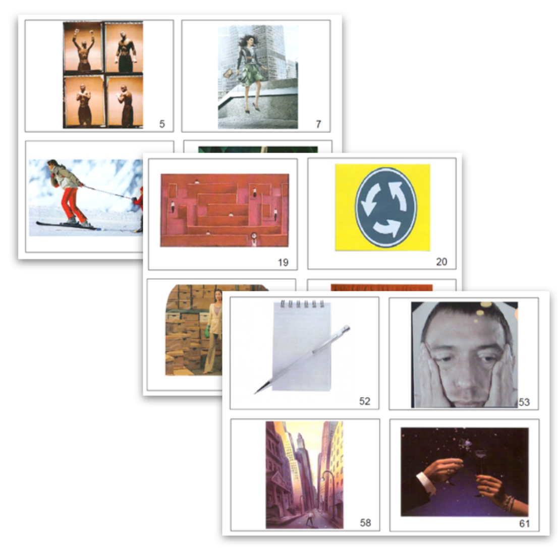
We began our concept tests chatting about the thoughts, feelings, and key moments during the job search process. We used metaphorical elicitation cards and asked questions like “which image does applying for a job feel like?”, digging deeper when required. After this initial warm up exercise, we presented concepts to participants and asked for their reactions.
Concepts for improvement
Concept testing – looking for what most deeply resonated with our users – was a key component of our design process. It helped us get more honest feedback, and figure out the problem to solve, rather than investing time and resources into solving the wrong issue.
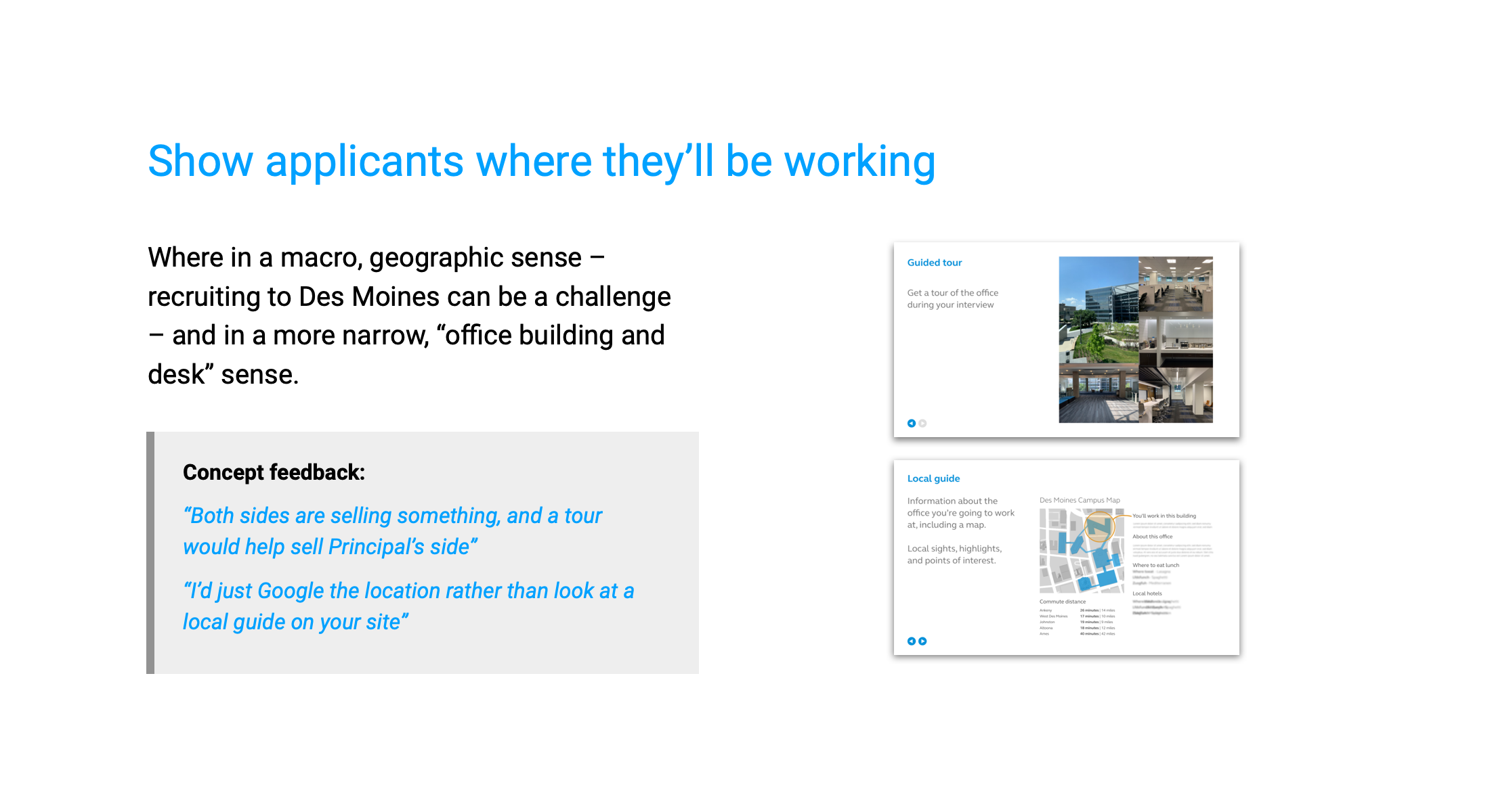
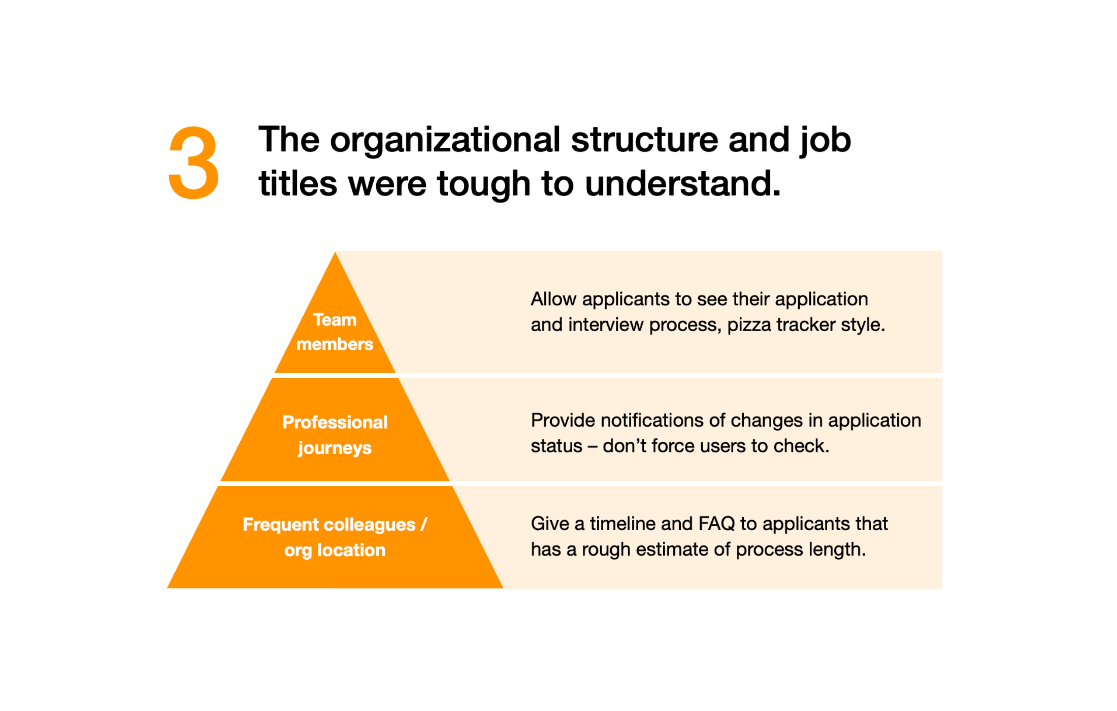
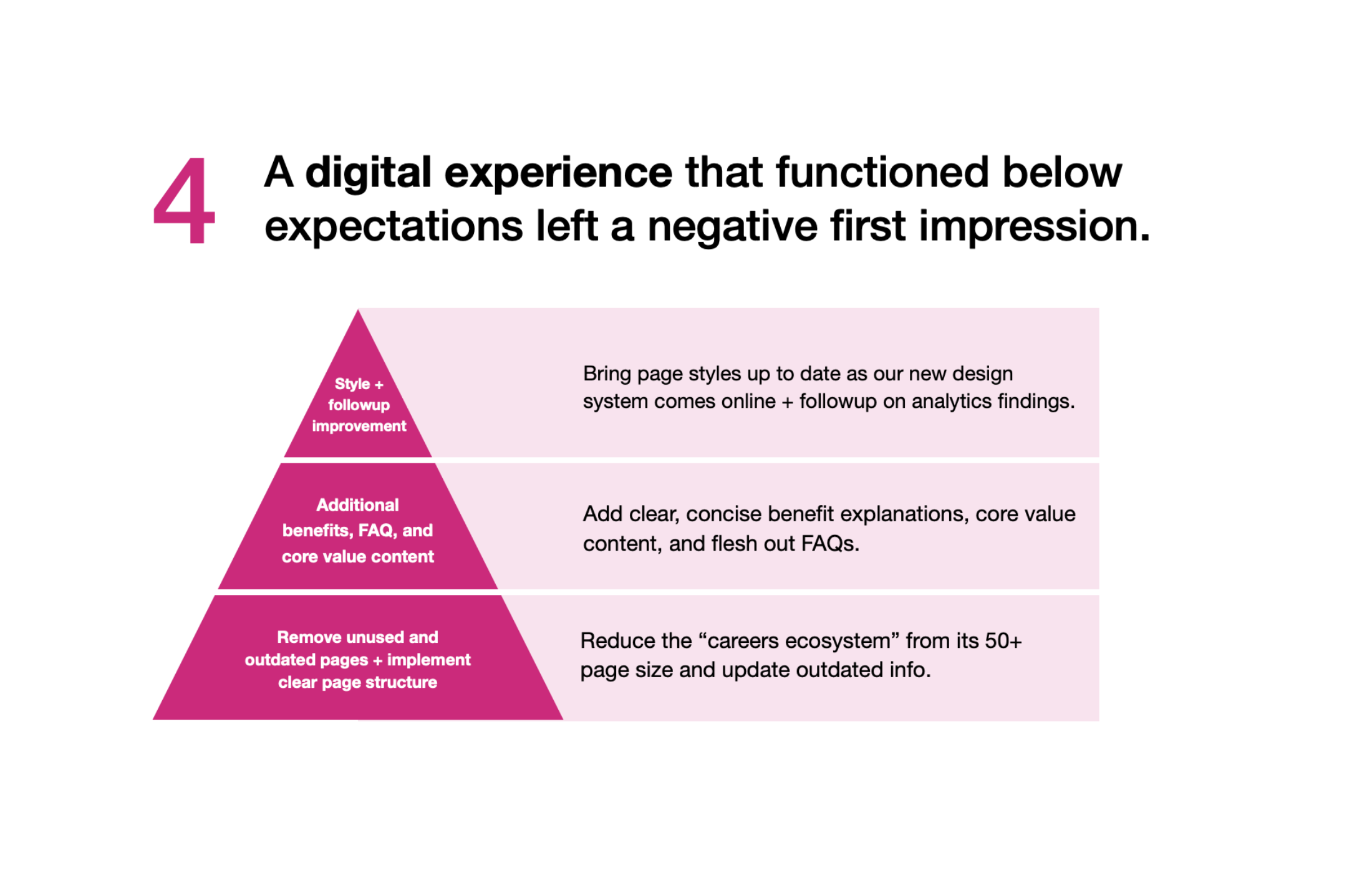
A clear set of strategic priorities to target
Based on our research, we highlighted a few key priorities for our digital applicant experiences. Beneath each priority, tasks were placed in a hierarchy. The idea? Work from the base, early maturity concepts towards the high level, “icing on the cake” tasks.
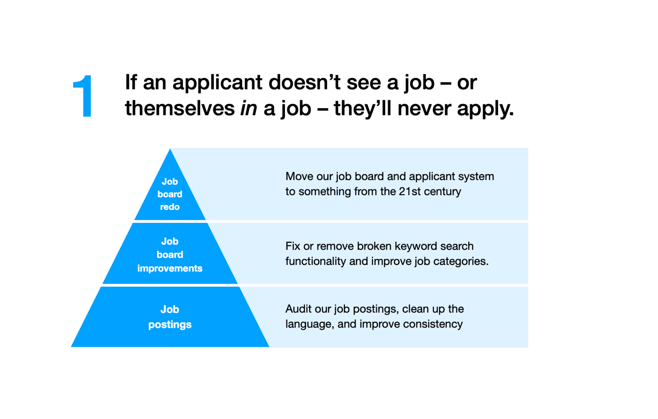
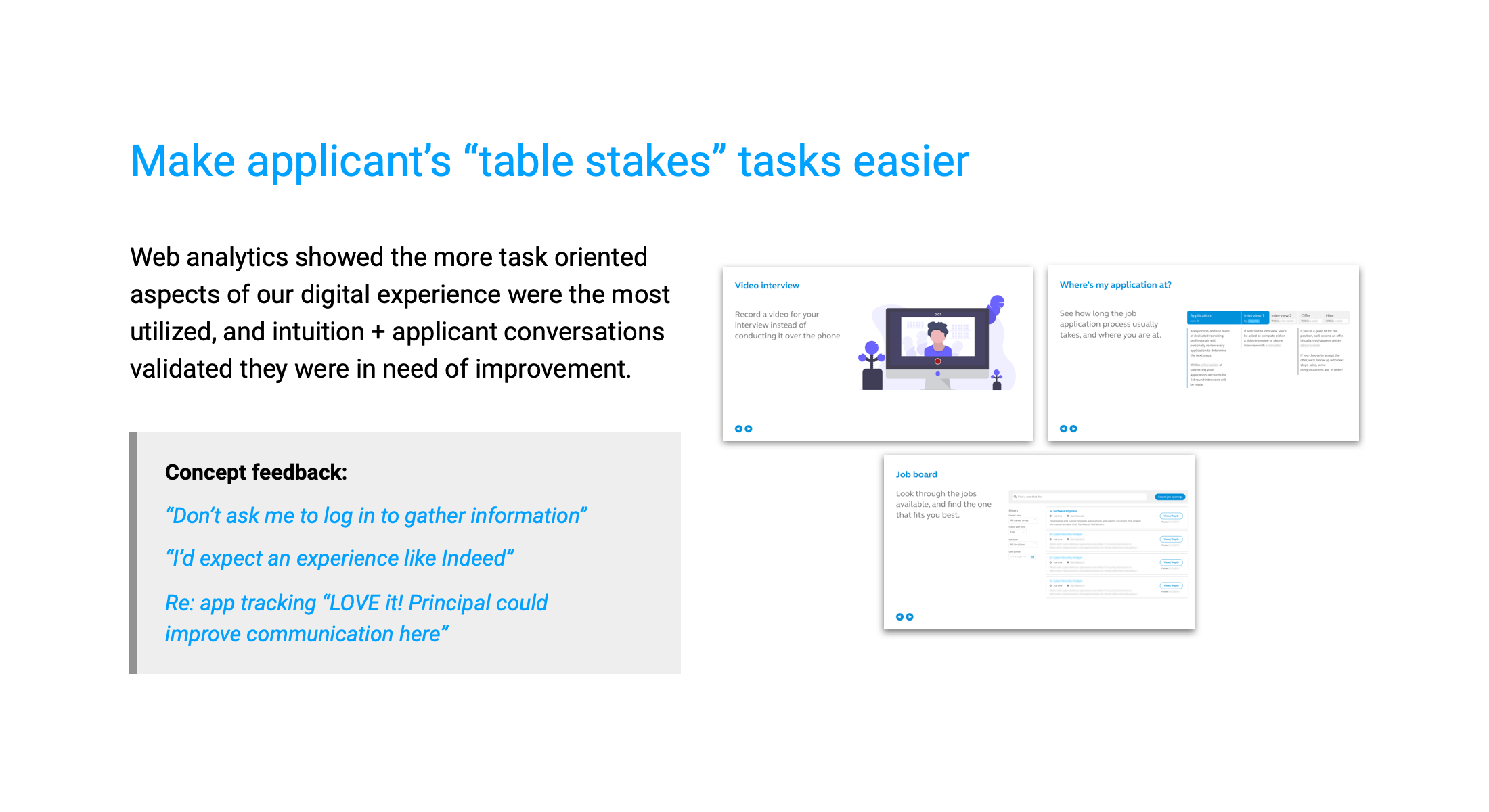
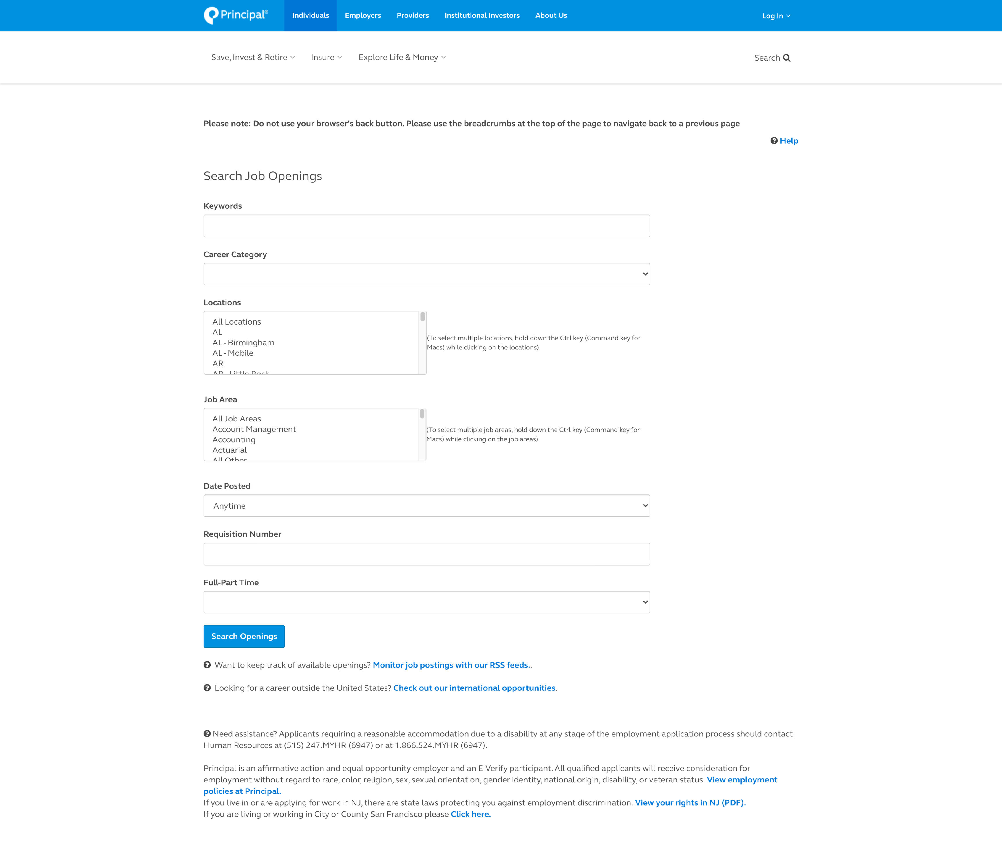
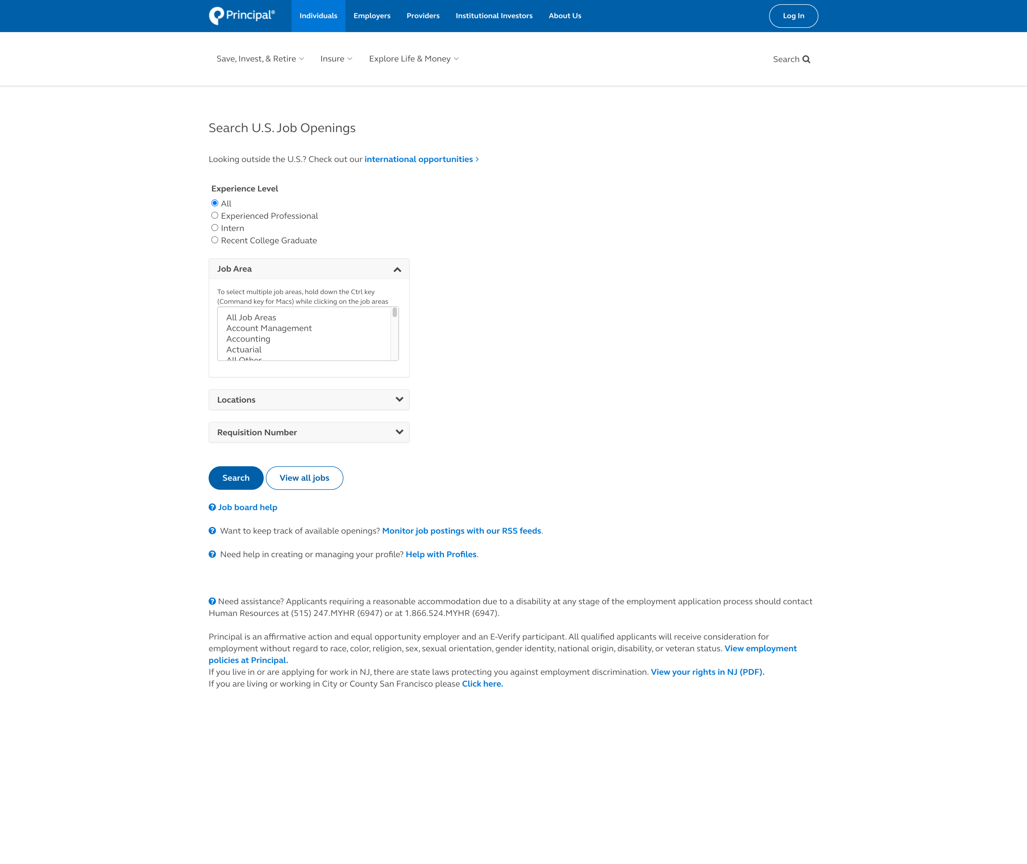
Revisions to our job board and job search experience
And, a recommendation to invest in a new Applicant Tracking System (ATS) to replace the dated backend. As of late 2020, revisions to our ATS are in-progress. Slide for before / after.
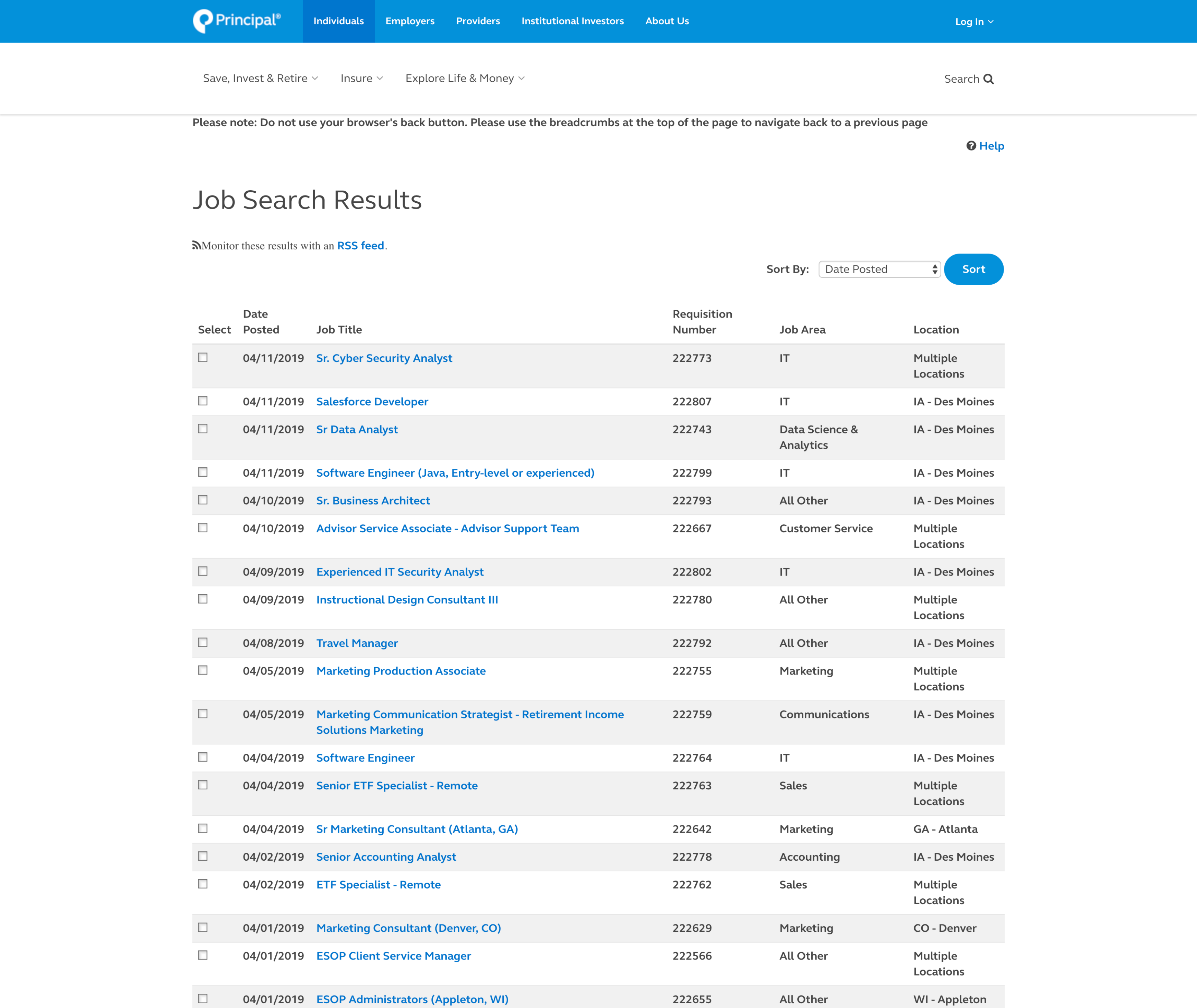
Job search
A few cryptic fields had to stay due to recruiting methods, but removing a non-functional keyword search, adding an option to view all job openings, and collapsing fields that returned few results all help make the page more usable. Not beautiful, but vastly more functional.
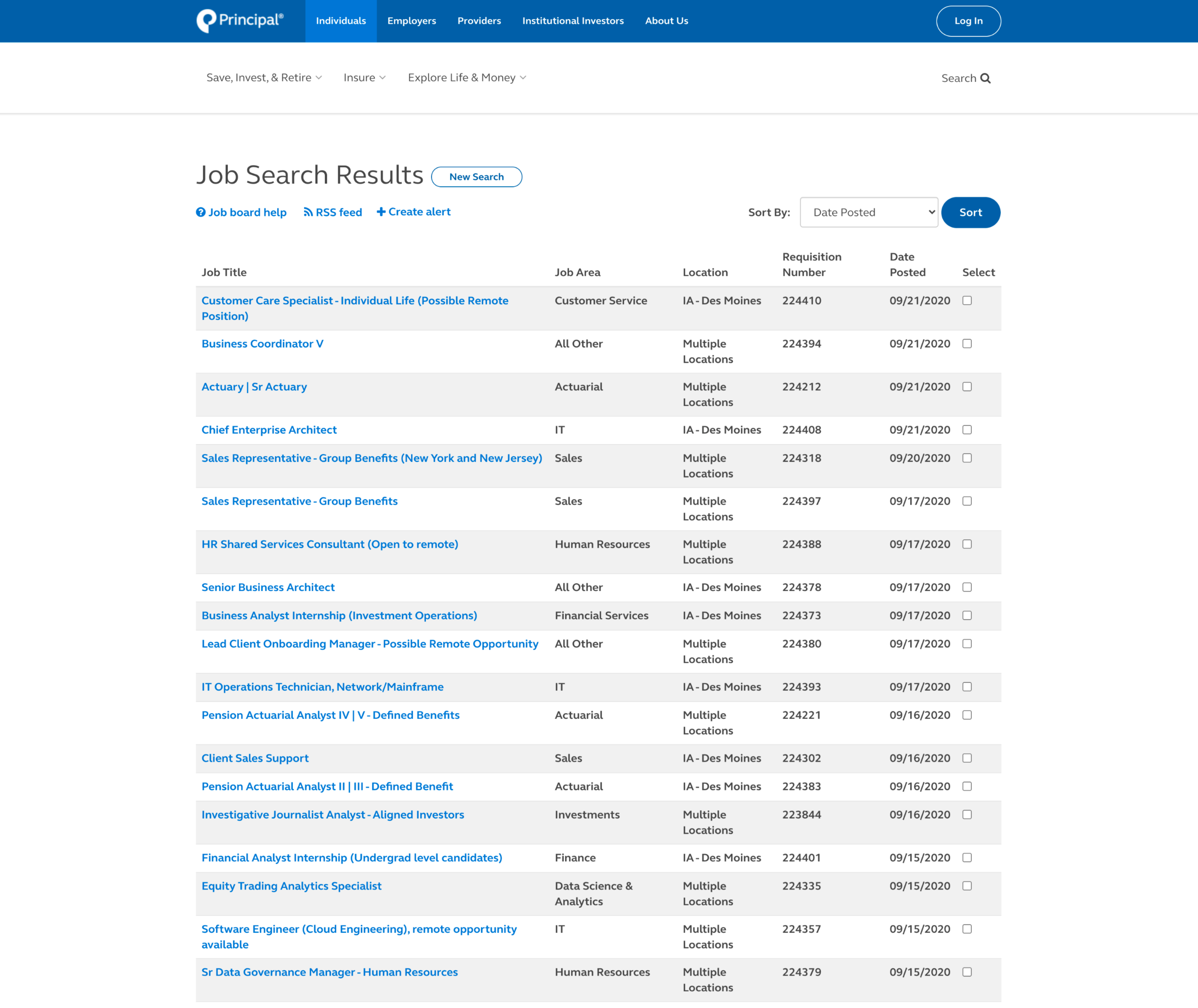
Job board
More minor changes – due to the restrictive, 16 year old back end used. But, the order of columns now makes sense, broken functions are deprecated, and an option to start a fresh search has been added.
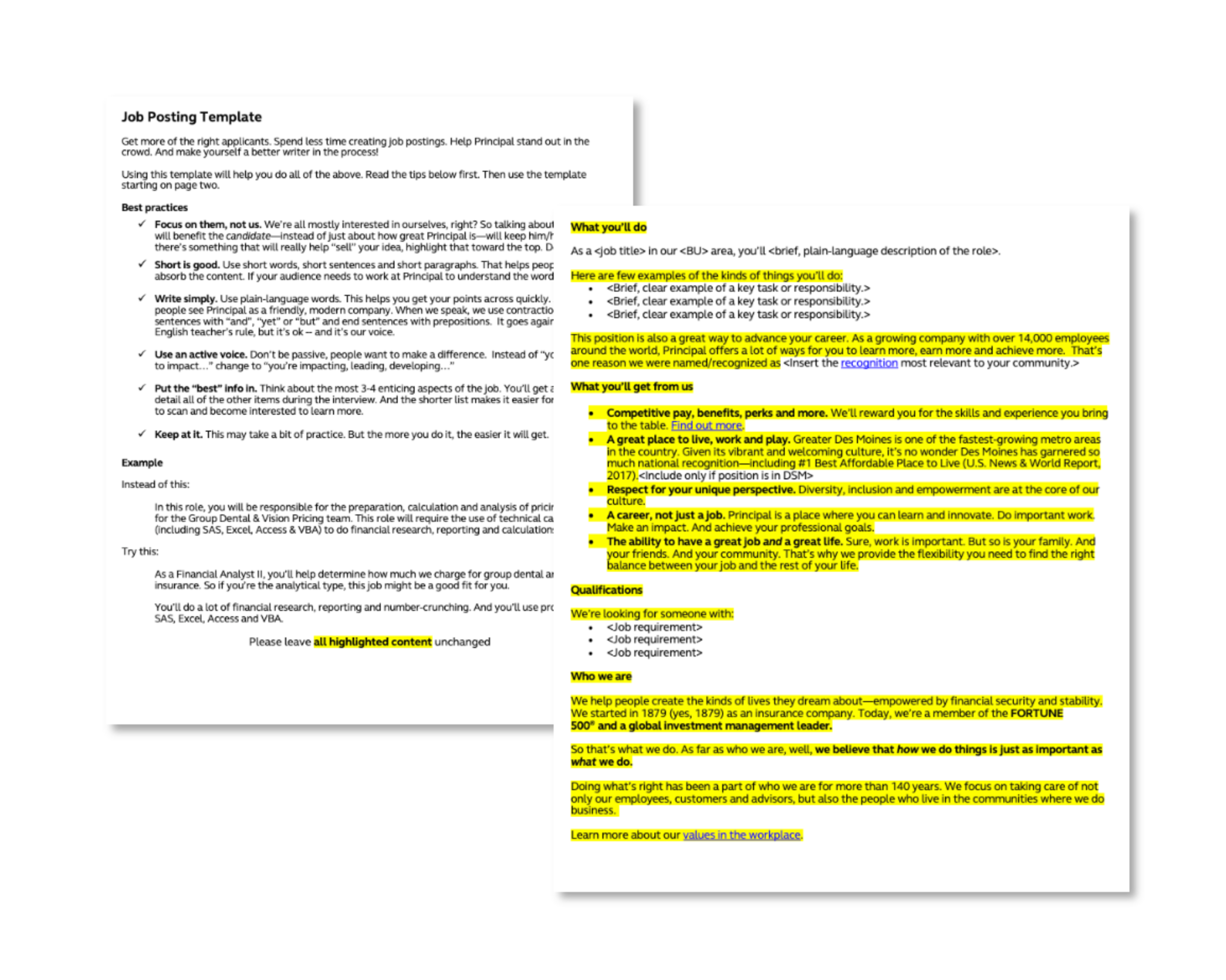
A templated approach to job postings
Working with a content strategist, we created clear language guidelines and a “fill in the blank” approach to avoid inconsistencies across hundreds of job postings annually.
By allowing some flexibility – but not too much – we let hiring managers include information that was important, but still maintained brand consistency.
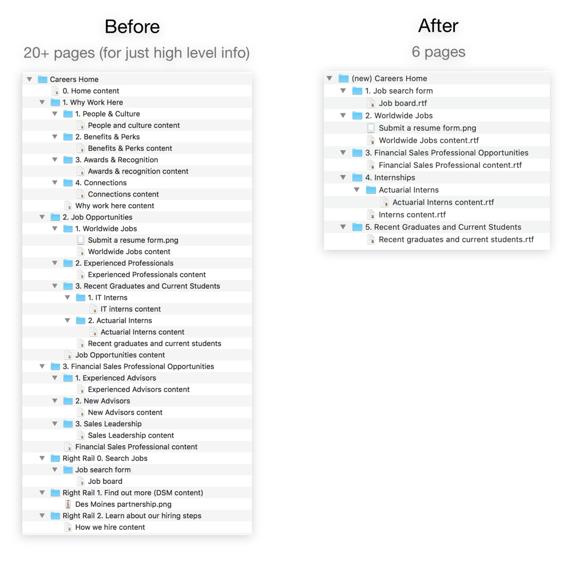
Revised careers site page structure and content
The combination of qualitative interview and survey research, and quantitative analytics gathering users paths and behaviors revealed that Principal's career site's structure was ineffective in a few ways:
- It didn't put the key information most visitors were looking for at the highest level.
- It buried a link to the job board in the right rail, or several clicks deep.
- The site contained over 50 separate pages, many under 200 words in length.
The revised careers site serves as a much better template for the talent team to build on top of, and update. Almost all of the information that users found most salient has been placed on the homepage, with several visible CTAs to the job board interspersed.
Page structure
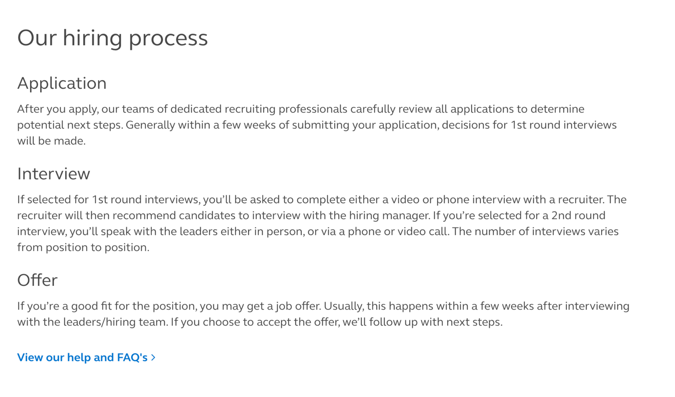
Additional content on benefits + hiring process
Retrospective
What worked well
We did a lot, with a little. On a ~$10,000 budget within a few months, we spoke to nearly 50 people in person and surveyed another 85. Changes were implemented to our job postings, careers website, and applicant tracking software. And we set our internal talent acquisition team up with a user-validated strategy for working on what matters most. And they ran with it.
The changes are not wild, or visually stunning, but an exercise in making the best of limited resources and providing meaningful, incremental improvements.
Things to improve
Our MVP level changes were implemented quickly – but changes beyond those happened on an extended timeline. Placing more specific time frames around next steps after my involvement tapered off may have helped.
A lack of dedicated long term experience design resourcing means future work must be staffed based on requests / documented needs. That's not always something that happens when issues require talking to a customer to uncover.