
Fixing the iPhone timer's "quick action"
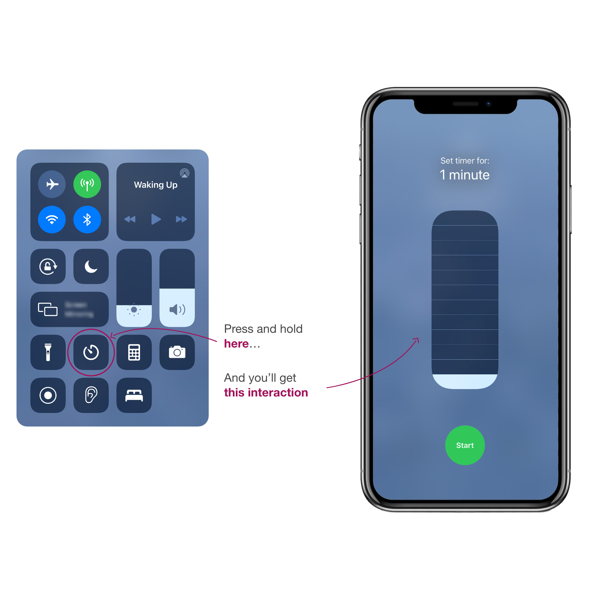
Ever use the "quick mode" of the iPhone timer? If you haven’t used the feature before, open control center on your iPhone or iPad, press and hold on the clock icon, and you’ll find it. It's great - but something about it deeply bothers me.
Why am I bothered by this?
It seems pretty inoffensive, no?

Does this interaction mostly accomplish what it needs to? Yeah, definitely... but there’s a bit of weirdness to it that bothers me. The kind of weirdness that the obsessive, data focused side of my brain can’t let go of. Look at the order and size of the time selection boxes.
Are these lengths of time equal? No.
Do they appear to be in this interface? Yes!
This just doesn't make sense.

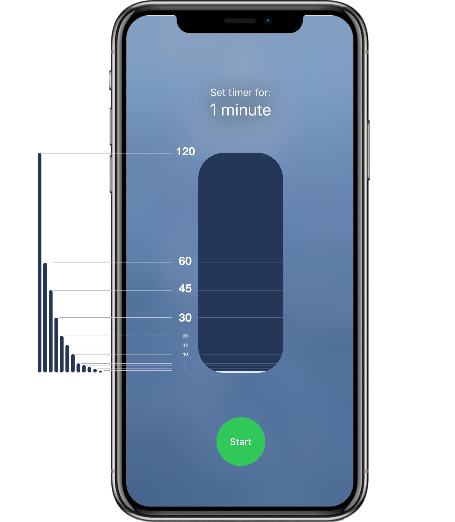
The full set of time values look like this when graphed on the same scale:

Testing a few ideas
Iterating in search of something better.
Making it proportionally accurate
So the immediate left-brained solution I want to jump to is making that pill shaped box divide up proportionally to the times it represents. But, that presents a little bit of a UI challenge.
Those bottom 1-5 minute intervals are basically invisible.
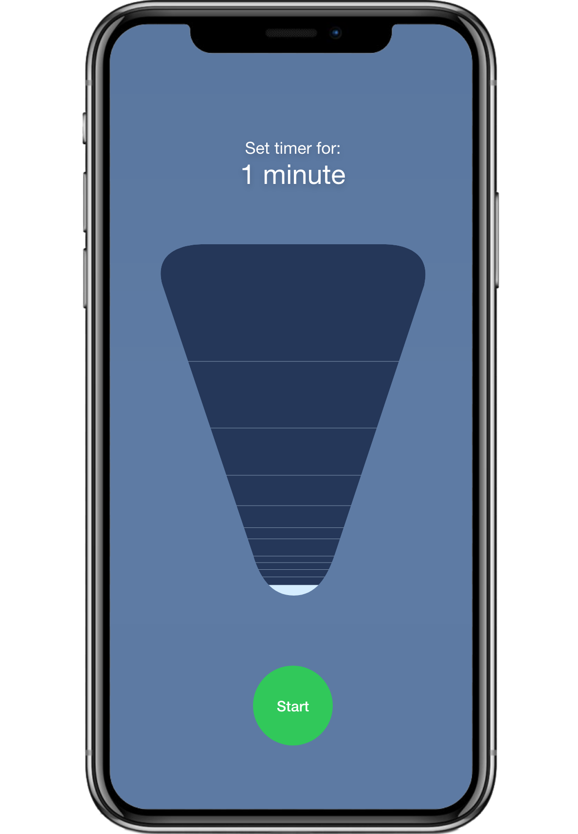
Make it a funnel
One could try to rectify the problem by going for more of a triangle shape. This is a little better for selecting the smaller time intervals. But, it's not without issues.
It doesn’t feel very elegant. And I’d guess it would create more questions for most users instead of providing clarity. Things get especially dicey since now time is equal to area and not just height.
More on that: Combined with the selected time intervals (1, 2, 3, 4, 5, 10, 15, 20, 30, 45, 60, and 120) that means the numbers grow consistently larger, but the change in height may shrink in between two numbers because this is all mapped to the area of an isosceles triangle. For instance, the trapezoid that makes up the difference between 5 and 10 minutes will be larger than the trapezoid that makes up the difference between 10 and 15 minutes. But, 15 minutes is more than 10 minutes... you can see how this would require far more thought than it's worth. I mean, at this point, why even bother with euclidian geometry?
Just for fun...
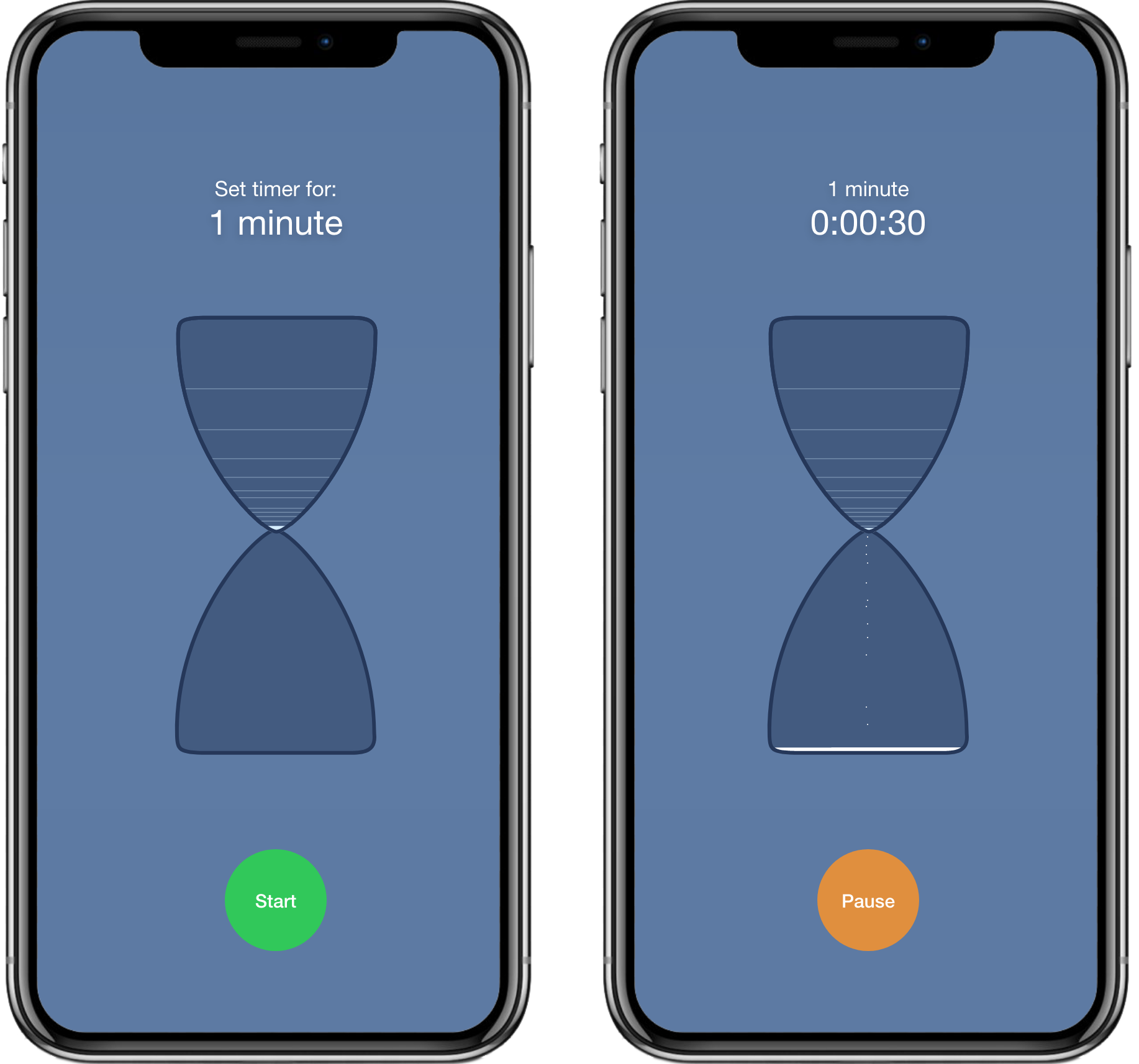
But just for fun, go one step farther with this concept – and make it a little more skeuomorphic. What if the timer looked like an actual hourglass?
Still, both of these are kind of dicey for small values. The hourglass is fun, but a bit on the nose – which, to be clear, is fine sometimes, but not when you’re losing usability.
Make it responsive
Another choice might be to roll with the existing interaction, but have it respond a bit more dynamically to the amount selected. Basically, as the amount increases, shrink the smaller numbers in size.
I dig that this preserves the same interaction, but wonder whether it would really provide a ton of additional clarity.
Sometimes (usually) the best choice is really simple
Let's use a clock to represent time.
Analogue clocks are:
- Quite common! Some might even say "essential to our modern society".
- Easy to understand.
- Handy for slicing time up into nice proportional sections. Yes, this is a construct – but it's a handy one.
And, they still leave some room for experimentation, interaction-wise.
Using existing interactions for inspiration
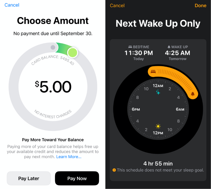
Apple has a pretty nice interaction that one could adapt to create a new, proportionally accurate selector, seen in the Apple Card payment screen and the Bedtime sleep scheduling screens.
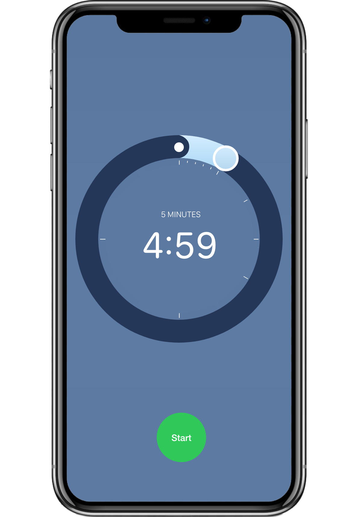
A ring slider for time selection
"'If you like it [a digital interaction] then you shoulda put a ring on it" - Beyoncé
Why the ring?
A ring slider is intuitive, since it looks like physical timers and avoids the issues of 1 minute intervals becoming invisible.
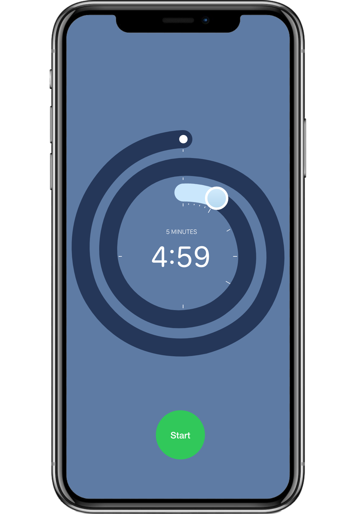
A ring... or a snake?
One of the most obvious negatives, though, is that one loses the 2 hour timer selection in this variant. I tend to think this isn't a dealbreaker, but just for fun, what's a two layer "snake slider" look like?
Probably not the move for usability... but I've never seen a more fun timer. Still, I think my winning nominee is the single layer ring.
Advantages of using the single layer ring slider
- Using a timer more similar to conventional timers and analog timekeeping pieces resonates with existing mental models for measuring and dividing up time.
- We use sliders for things like volume and brightness quite commonly – but not for time in any other instance I can think of. The current "quick mode" interaction is kind of an outlier, representational accuracy issues aside.
- This approach more accurately represents the relationship between minutes and hours.
- When animating the time running down (or adding additional time while the timer is running) this approach “just makes sense”.
Drawbacks of using the single layer ring slider
- This is a big one: you lose the simplicity of up = more time / down = less time when you add another degree of freedom. That may make the intended, one handed “quick” operation more cumbersome.
- For example, in the first quadrant of the ring, increasing X values = more time, while decreasing Y values = more time.
- Compare that to the third quadrant, where decreasing X values = more time and increasing Y values = more time.
- For example, in the first quadrant of the ring, increasing X values = more time, while decreasing Y values = more time.

- Another negative: this interaction changes something that is likely a relatively well known convention at this point. Lots of people have used the current interaction. That’s not without some costs.
So, should Apple adopt my solution?
Well, probably not. Losing the convention of the interaction being accessible through 1 axis of motion may not be worth the gain of a more aptly fitting mental model.
The only scenario that gives me pause and makes me think maybe is if the core (non quick action) interaction was changed to more closely resemble an actual timer. This doesn't seem completely out of the question, as in iOS 14 betas, Apple has abandoned the "rolodex" approach for time selection in alarms, leaving the timer app an outlier.
Either way, the explorations of alternate ideas have helped me understand why the current interaction was chosen. That's always a valuable exercise!